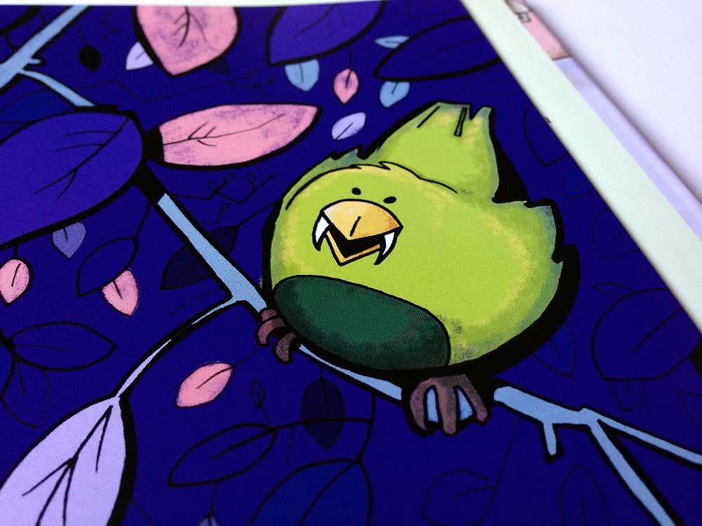
Both adults and children can enjoy it, and whilst I welcome someone dressing up as a hotdog or a cat on Halloween night, I prefer the spookier stuff. Isabel Atherton and I created a book for children, called Smelly Ghost, and one for adults, called Zombie Cat: The Tale of a Decomposing Kitty. Isabel made both stories immerse themselves in a creepy world: a zombie apocalypse and an alternative monster environment like our own. It was my job to create the right context for both of these.
One of the most important parts of a book is the colour palette, especially with such a whimsical subject matter. Of course, Halloween has its own colour scheme. The orange of the pumpkin, the black of the witches hat, the inky blue of the night.
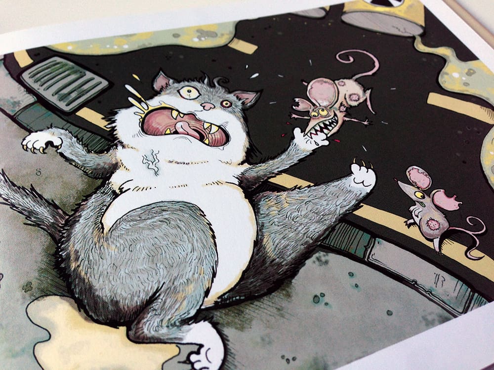
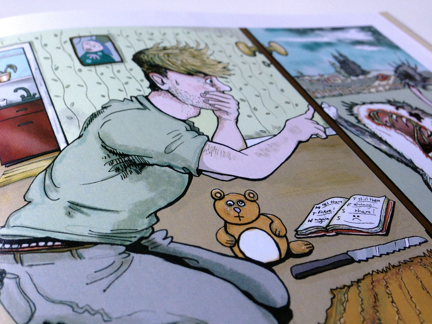
For Zombie Cat, the palette was deliberately muted. Even before the apocalypse arrives, the industrial grey of the future is used generously, both in the pavements of the backdrop and the dull fur of Tiddles himself. As time goes on and Tiddles becomes ZC, the page is punctuated by bright reds to make blood more shocking. The reader might wince to see not only the oozing of the red, but the greens and yellows that spew forth from ZC’s eye sockets. It was extremely satisfying to draw!
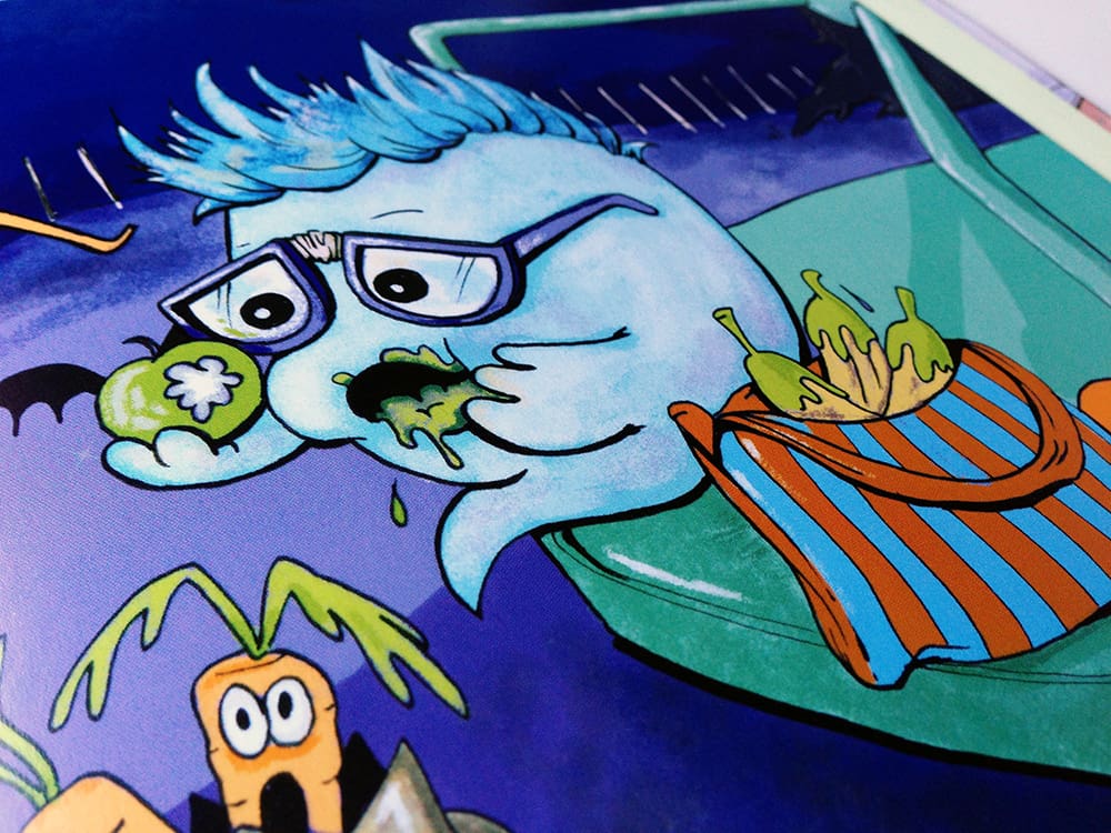
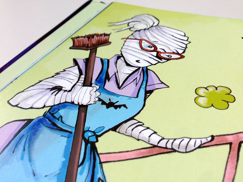
Smelly Ghost needed to be brighter, happier. I used very bright greens and purples, injected accents of pink and tried to avoid too much red. Anything too graphic would be too much for a young reader, so the red was reserved for a monster’s coat or a pair of glasses! The dominating pairing was the purple and green, a satisfying combination for a Halloween book for children.
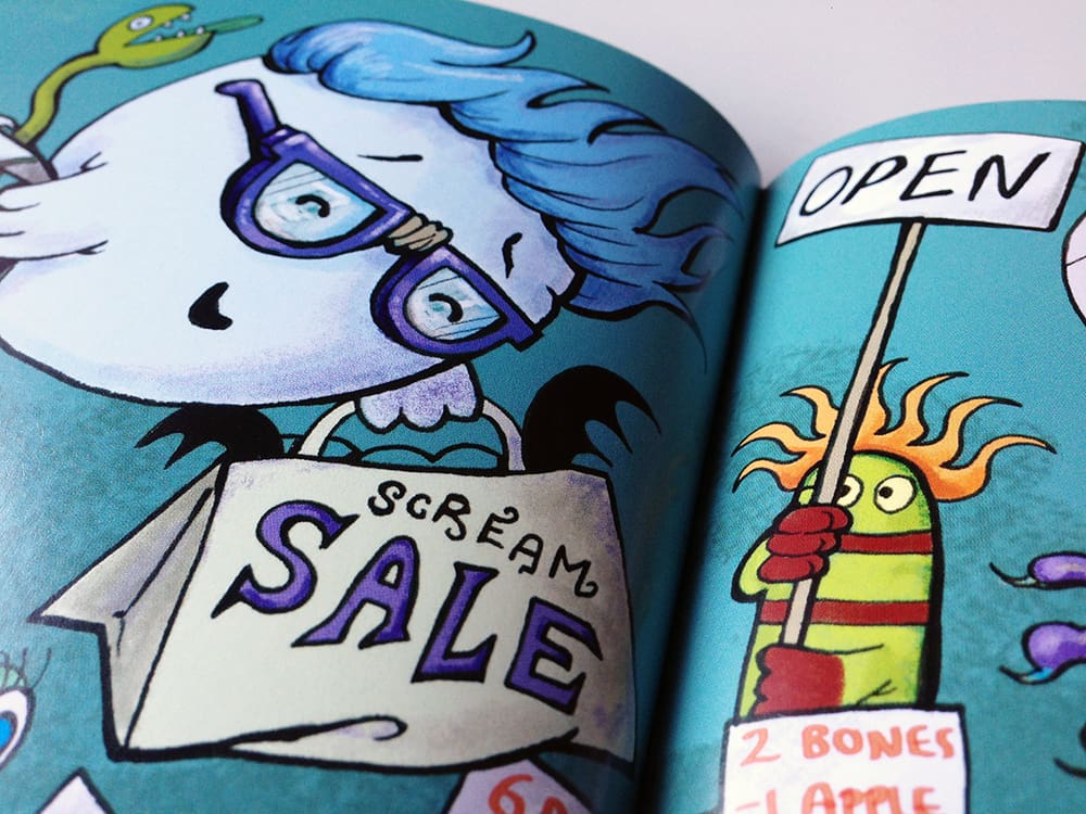
One of my favourite parts of creating a book is choosing a colour palette to match the story. It can completely change the direction your work heads, and it can ruin or make a book.
“Isabel Atherton helped me find the best place for my first picture book – the award winning ‘The Only Child.’ She is not only a experienced and professional book agent, but also a trusted friend, who guides like a friend and shares ideas. The process of book publishing with Isabel was a really sweet and smooth journey for me.”
Guojing, Creative Authors Client.